Solving the 3 Oddities in our Data

As Poppy blogged below, we identified three unusual features in our data. These were the cold dry layer at 2500m, the turbulence in the stratosphere and the rise in humidity also in the stratosphere.

We have managed to solve all three of these by identifying research which supports these findings.

The Cold Dry Layer:

This graph shows a tropospheric dry layer at 2500m where the humidity drops from 80% to 20%. Although this is in the Western Pacific, we do not see any reason why this does not support our data.

Turbulence in the Stratosphere:
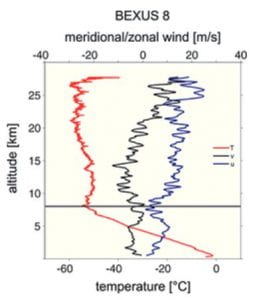
This graph shows the results from the Leibniz Institute Turbulence Observations in the Stratosphere (LITOS) BEXUS 8 weather balloon experiments from 2014. It shows Westward drift in the stratosphere but there is very significant variability up to 20ms-1 in each direction. This supports our data, and explains the Great Asby Switchbacks.

Rise in Humidity in the Stratosphere:

This graph shows a rise in humidity from the tropopause at circa 13km up to fairly high in the atmosphere (circa 28km) from humidity tests conducted by the AWIPEV Research Base in Ny-Ålesund, Spitsbergen. This is exactly what our data also shows.

References:

Tropospheric dry layers in the tropical western Pacific: Comparisons of GPS radio occultation with multiple data sets: Therese Rieckh et. Al

Characteristics of stratospheric turbulent layers measured by LITOS and their relation to the Richardson number – A Haack et. Al

stratospheric Water Vapour in the Arctic (AWIPEV Research Base in Ny-Ålesund, Spitsbergen) – Dr. Marion Maturilli

Further graphs of our results

Here are more graphs of our data collected:

The graph above shows speed of sound vs altitude. It works very well up to 5000m, but after that we suspect that the conditions made it impossible to measure any more data using the same sensor!

The graph above shows external temperature vs altitude. Notice the clear turn around point where the temperature starts to increase again – this is known as the tropopause which we have blogged about here.

The graph above shows radiation vs altitude. Despite all of the trouble the sensor gave us, its data really is fantastic. You can clearly see the Regener Pfotzer Maximum (black arrow) where the radiation levels are the highest in our atmosphere.

Graphing our results

The data from our balloon flight is fantastic! The three graphs below show the following:

The graph above is altitude vs time, showing the perfect linear ascent, and exponential descent.

The graph above is pressure vs altitude, which illustrates a textbook exponential decay curve.

The graph above is humidity vs altitude which shows the reduction in moisture in the atmosphere as you ascend, but also shows the oddities which we have blogged about here.

Flight path of the John Dalton

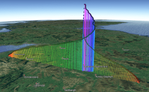
The flight path of our balloon is quite unique, it managed to do 2 loops where it intersected its previous path. The pink area is where the balloon reached the highest point, and burst.

I have created a video to show the amazing shape of this path –  we think it is quite stunning!

This process is done using Google Earth Pro (download here) where you open a certain file, and you can see the path for yourselves!

2020 Flight Path

To view the flight path:

Download the file above titled “2020 Flight Path”

Download Google Earth Pro (also linked)

Double click the “2020 Flight Path” file or simply open it in Google Earth Pro

Launch Day Media Plan

We decided that it was important to share the event both to let people know in advance that it was happening, and also to share news on the day in real time.

PRESSCUTTINGS_

i. Press Release

We wrote a press release and sent it out a week before, attached images of our progress so far and sent it to the local newspaper, the Times and Star as well as Cumbria Crack.  It was nice to see our news story both in the press and online.


2. Media Coverage on the Day

We set up a twitter account several months ago but it really came in to its own on the day. We decided it would be more interesting if we considered the content in advance and spent many hours going through a communication plan and compiling facts, tweets and potential data points to tweet about.

We tweeted over fifty posts on the day. Before this we were not aware of the best way to gain publicity, or the tweets that people found most interesting. After posting a variety of written tweets, photos and videos, it has become apparent that the tweets people like the most are generally those with attached photos and videos. To date the first images taken from the cameras on board the balloon saw 979 impressions, and the ‘burst’ video has had the highest number of impressions with 1,098. These are still going up. A number of our school teachers kindly shared and ‘liked’ our earlier tweet posts which helped extend our coverage. Thank you Miss Forester and Mrs Quine!

Day after

We sent out a second press release the day after the launch. A link on facebook saw a number of really positive comments and also prompted discussion from some about whether the earth is flat!! We continue to write tweets with links to our blog with further detail.

Know any meteorologists?


So the data has thrown up some oddities that we are trying to understand;

  1. DRY & COLD LAYER

The first oddity is that the balloon went through a dry and cold layer at about 2500m [figs 1 & 2]. We know these are not erroneous readings because multiple sensors picked this up and we also saw the same thing on the way down.

If you look at the humidity graph [fig 1], you see the low cloud shortly after launch, then the odd cold dry layer, then a little bump (higher level cloud) and then it descends.

Fig 1 & 2. Humidity and External Temperature against altitude of the balloon


2. GREAT ASBY SWITCHBACKS

You can see in Fig. 3 that the balloon travels with multiple sharp changes of direction in the stratosphere and we are trying to understand these.  They happened above Great Asby, hence we are calling them the “Great Asby Switchbacks”.

Fig 3. Data from the balloon flight illustrating the Great Asby Switchbacks

3. HUMIDITY RISES

The third oddity is that the balloon’s sensors detected a humidity rise through the stratosphere. Gradual but noticeable [Fig 1]. We see the temperature rising back up (even above 0 degrees C) but the rise in humidity is unexpected [Fig 2].  That would be consistent with the increase in temperature (more moisture can exist in warmer air) but it is not what we expected.


WHAT WE KNOW SO FAR

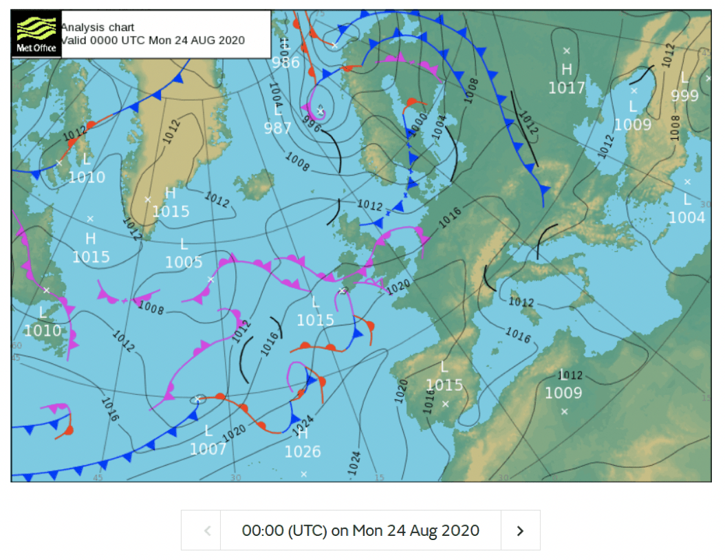
  1. The balloon was effectively flying along the line of an occluded front as seen in Fig 5. We know that these can create cyclones (cyclogenesis) but we did not expect that that the effect could rise into the stratosphere.
  2. The jet stream was quite strong West – East over us as seen in Fig 4  but, again, we assumed that the effect would be lower in the troposphere.
  3. We know that it is possible to have layers of cold dry air in the atmosphere, but we saw this layer on the way up and on the way down – so it extended some 90km and was only 1km thick.
  4. We expected a consistent “drift” in the stratosphere and small changes in currents could be expected, but we were not aware that such “turbulence” could occur in the stratosphere.
  5. On humidity, we understand that there is a process of transfer of water (ice) from the troposphere into the stratosphere, but we expected it to concentrate moisture lower down.

DOES ANYBODY KNOW A METEOROLOGIST WHO COULD HELP US UNDERSTAND WHY???


Fig 4. The Jetstream at the time of the balloon flight


Fig 5. Weather fronts at the time of the flight


Raising funds to help other young scientists

We have had an amazing experience and learnt so much about science, planning and teamwork from this project. We believe that this type of project should be available to more young people in the UK. We were lucky because our project was sponsored, but others may struggle to raise the necessary funds. We would like to try to raise £1,000 to donate to other science projects. We have named our balloon and we have decided to name our fundraising after John Dalton.  John Dalton is a brilliant scientist who was born locally to where all the members of our team live.

Here’s the link if you’d like to donate

More to follow…

Launch Day Snapshot

On the 24th August, our team awoke early to put our many months of worries, troubles and hard work to the test. After following countless checklists, fixing many issues and making sure everything is ready for launch, the balloon was launched at 9:34AM from Mosser near Cockermouth. It rose through the atmosphere. Our electronics immediately started transmitting all of the data successfully, and many enthusiasts locked into our payload’s signal through tracker.habhub.org as far as Belgium and the Netherlands!

The balloon was targeted to climb to 30,000 metres (99,000 feet), but astonishingly, it rose to over 36,000 metres (over 3 times the height of commercial airliner maximum cruising height, and 10,000m higher than the highest flying aircraft – the sr71 “Blackbird”).

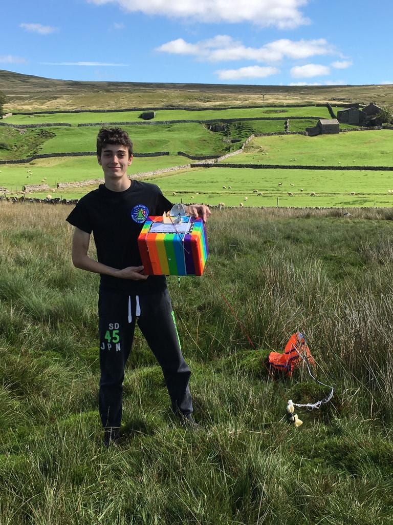
After performing a mesmerising series of switchbacks (see above), the burst point occurred directly above a point 10km East of Great Asby, and the payload landed in Arkengarthdale, in the Yorkshire Dales. At this point, the chase car and recovery crew were in hot pursuit, and within a kilometre of the landing spot as it touched down. The balloon was successfully recovered, with all of its precious data stored safely on the dataloggers, and on Habhub. Overall, the launch day was a complete success and we would not change how it went – because it went so well!

1 2 3 14