
Graphing our results
The data from our balloon flight is fantastic! The three graphs below show the following:

The graph above is altitude vs time, showing the perfect linear ascent, and exponential descent.
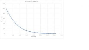
The graph above is pressure vs altitude, which illustrates a textbook exponential decay curve.

The graph above is humidity vs altitude which shows the reduction in moisture in the atmosphere as you ascend, but also shows the oddities which we have blogged about here.