In my blog about ascent rate I showed that the ascent rates at ground level could be calculated from the volume of helium and that once gravity was equalised by the lift force, the drag worked against the lift force to create an equilibrium.
What is surprising is that the ascent rate of the balloon remains constant at all relevant altitudes. In the graph of last year’s balloon ascent here, you can see that the ascent follows a straight line. The descent rate follows an exponential decay curve. The question is why and the answer is interesting.
On the ascent, the balloon is encountering decreased density, as the atmosphere rarefies (gets thinner). You would think that the balloon would therefore speed up. However, as the balloon encounters decreased pressure, it expands. As it expands, the drag force increases. Neither of these effects is linear, but it just so happens that they largely cancel each other out, which means that the balloon rises with a roughly constant rate.
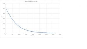
For the descent, the drag is being provided by a parachute. The parachute is the same size regardless of altitude. So, the balloon initially descends very quickly and slows down as it encounters denser atmosphere. The descent rate effectively follows the inverse of the pressure curve which is shown on Tash’s blog here and our blog here.